Sunday, September 29, 2013

Horlicks, Bournvita and Complan = Child's Grow

Mainly, three health drink brands are consistently focus on Child’s Growth by representing nutritional supplements & Vitamins. Those brands are Horlicks, Bournvita and Complan…

Market Share in India: - Horlicks over 50 % holding market, Bournvita 16.2% whereas Complan having 13.9 % (Till March ’13).

On this time, two brands have been made change and rolled out with distinctive campaign to sustain in market and rapidly movement of brand.

Bournvita Strategy:- Released campaign with new punch line “Taiyyari Jeet Ki (Preparing to Win)”. Overall campaign is emphasize on every aspects “Good Habit” for child growth. Mother is continuously preparing his boy for race, ultimately boy chase his mother after continuous efforts and at the end of campaign conveying message that “Only Mother can understand better prominence of good habit”. Good habit is that mother is giving Bournvita daily.

Good campaign which gives energy and boosting up confidence as compared to prior one “ Doodh ka calcium waste (waste of Milk’s calcium)”.

Complan Strategy:-
(1) First campaign interaction between Doctor and Boy, the problem of boy is Height because his colleague calling him Chhotu i.e. small in height and asking for solution to Doctor. Doctor suggesting Complan which grows two times faster.


How can alone boy directly ask to Doctor? It can’t possible and should not represent. Poor strategy is being used by Complan. Tomorrow, it may chance that every school boy going directly to Doctor and ask for any solution.

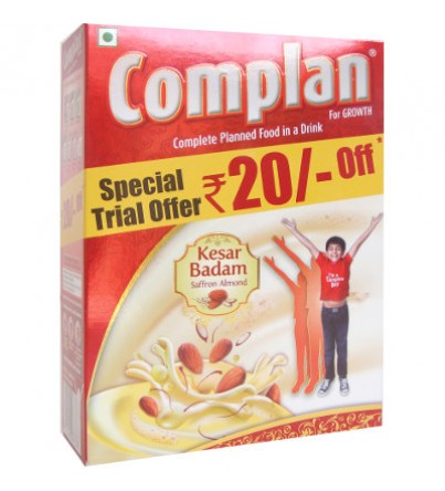
(2) Second campaign Complan rolled out new campaign with Price conscious factor from brand conscious. Complan is offering Rs. 20 off (INR) So hurry up…


TVC is shown that one boy is feeling mood-less because his colleague called him “Chhotu i.e. small in height”. Suddenly his friend is coming and suggesting that “Tell your Mother to give you Complan, and boy replied with wonder expression Complan!, but in off-mood saying mother is giving cheaper health drink, not giving Complan. 

At the end of campaign Smile comes on boy’s face while his friend telling that now Rs. 20 off convey the same to your mother.

Always should taking care in communication dialogue that punching “Mother is giving cheaper health drink”. It should not use because mother is always caring and thinking good for her child. Mother is supposed to buying health drink for result, not for price and she knows well which one is better for her child. 

Today, consumers are aware well about Horlicks, Bournvita and Complan. By reducing price, consumers will not switch over rapidly from one brand to other in this segment. Health drink for child is such segment where brand is “Value for Money”, consumers will ready to pay willingly if they will be getting good results.   
It could be better if Complan has released some innovative campaign rather than price.


Share your Views… 3 BRANDS = CHILD’S GROWTH

Saturday, September 21, 2013

Snack Time, Fanta Time by Fanta

Fanta has carried on “Zyada Fanta, Zyada Masti (More Fanta, More Fun), rolled out new campaign with “Snack Time, Fanta Time”. This is the merely brand in entire soft drink market which has been released 3D campaign with animated protagonist since more than two years.


Previous Post for Reference of Soft Drink Market:- http://www.viragbrand.blogspot.in/search/label/Fanta

The new campaign ““Snack Time, Fanta Time”, is trying to change perception and precisely conveying that take Fanta during snack time. Fanta has executed innovative campaign with good strategy and emphasize on to change consumer perception. Traditionally, people are drinking tea/coffee during snack time in India (Including youth). Though, Fanta is mainly targeting to young group consumers.


Two brands in India have been changed utmost consumers perception:-
(1) When any celebration, occasion, begin anything new or festival comes, consumers are preferring Cadbury Dairy Milk as Sweet. Since launching campaign “Kuchh Mitha Ho Jaye (Let’s have something sweet) by Cadbury Dairy Milk, being getting huge success and sorely touching emotionally.


(2) When Wednesday is coming, it reminisce that Hafte ka Sabse Sasta Din (Economy day of Week for buying any household items) by Big Bazar (Giant Retail Outlet & brand of Future Group).


This can be really good attempt to build brand image in mind of consumer because today consumers are willingly want to change, finding new things and if such campaign will be commencing to “Click”, brand will become strong. Campaign should be endure with same message like Cadbury Dairy Milk and if Fanta can endure its campaign “Snack Time, Fanta Time” at regular interval, it has chance to go hit against rival brand Mirinda (PepsiCo).

“BUILD BRAND BY CHANGING CONSUMERS PERCEPTION AND WILLINGLY ACCEPT THE SAME”


Tuesday, September 10, 2013

Yahoo : New Look


Insistently, Re-branding/ Reposition trending is going on since 3 years. Many companies have already been made change in its corporate identity / brand identity as well as also taken good reposition in market. 

Herewith, I would like to share list of brands which have already been unveiled with re-branding almost within 5 years, out of which major brands has revamped in merely 2 years. The lists are as under:-
(1)    Videocon (Changed in Logo)
(2)    Titan (Watch brand):- (Recently, Changed in Logo with new brand name Titan Company)
(3)    Airtel (Telecom Service provider):-  (Changed in Logo)
(4)    Star One (GEC TV Channel):- (New name Life Ok with new logo & taken strong position where viewers forgot Star One).
(5)    Zee Tv (GEC TV Channel):- (Changed in Logo)
(6)    Mastii (Brand of Sri Adhikari Group – Hindi Music Channel):- (Changed in color of Logo)
(7)    Big Bazar:- (Changed in Logo as well as Tagline)
(8)    Micromax Mobile Handset :- (Changed in Logo)
(9)    Godrej:- (Changed in Logo)
(10)Nivea:- (Changed in Logo)
(11)P & G (Procter & Gambel:- (Changed in Logo)
(12)Dowjones:- (Changed in Logo)
(13)Mozila Firefox:- (Changed in Logo color)
(14)Domino’s Pizza:- (Changed in Logo & remove name pizza)
(15)Facebook:- (Changed in Logo i.e. shape of 'F' with line shade)
(16)Twitter:- (Changed in Logo i.e. changed bird picture)
(17)Microsoft:- (Changed in Logo)
(18)USA Today:- (Changed in Logo)
(19)Ebay:- (Changed in Logo)
(20)Universal Pictures:- (Changed in Logo)… you can add many more …
Now, one of leading, holding 2nd rank overall and holding 1st rank commercially e-mail provider search engine “Yahoo” unveiled with new brand identity / re-branding across globally, that has been made change in color & font shape of logo.  

Changes are done like from lighter to darken purple color and from jumbled shape of font to sharp/straight font. However, Last letter ‘O’ is remained little jumble. 

New Logo
New logo of Yahoo may be letting down to users and it is not sorely reflecting as well as also not finding anything new which can identify differentiation. Really, old one logo is much better than new one if we will compare yahoo products. Yahoo is mainly providing commercially good service (i.e. E-mail/messenger) and other like updating world’s news, fun, entertainment, sports etc. overall all kind of general search. So, overall if we can analyze, old logo seems perfectly as per offering various services by Yahoo. 

Color is playing key role while creating logo, each colors having significant & well-defined. Only colors can enable to build your brand identity. Many consumers can identify various brands with color itself likewise symbol or sign.  

Here, Yahoo has changed color & rolled out with darken purple. While making logo, Purple color implies for ceremony, expensive, luxury, fantasy, justice, mystery, nobility, regal, royalty, spirituality and sophistication.  Yahoo is basically search engine web & commercially e-mail provider so that here it can say lack of color combination which may letting down brand image. 

Yahoo does not requiring to change in logo because it’s already been built up brand image globally and was going good. If supposed to want to change, then it could be change in mail service & other general as per users demand. Service would be better than changing in corporate image. Corporate image can build itself or automatically if you can provide best service to your customers. 

Once you change your corporate / brand identity, must be remember that now you will have to build up re-position /re-branding where customers/consumers can identify new brand image and forget old. And, re-branding task is sorely tough than branding. It is also requiring influential strategy to take re-position.

 Let’s see what will be review of users towards Yahoo!

Share your view…